In today’s data-rich environment, it’s easy to overwhelm audiences with excessive information. The key to effective business communication lies in presenting data in a compelling and easily digestible format. Just as illustrations enhance a story, visual aids like bar graphs can transform presentations.
Business graphs, including bar charts and bar graphs, offer a simple yet powerful way to convey information. Instead of dense slides filled with numbers, a well-designed bar graph can immediately capture attention. The tallest or shortest bars naturally draw the eye, allowing you to guide the audience to key insights, such as high sales figures or low costs.
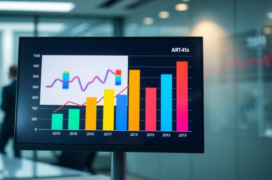
Alternatively, bar graphs can illustrate trends, such as increasing sales over time. A bar chart displaying monthly sales from January to August can clearly demonstrate growth, instantly engaging the audience and setting the stage for a more detailed discussion.
To maximize the impact of bar graphs, consider these tips: Clearly label each bar to avoid confusion, use vibrant colors to highlight important data points and subdued colors for less critical information, and ensure that every graph is relevant to your presentation’s message. Avoid including graphs simply for aesthetic purposes. Embrace creativity and have fun with your visualizations. When used effectively, bar graphs can significantly enhance audience engagement and comprehension, ensuring your message resonates long after the presentation ends.