While Microsoft’s PowerPoint may not be a design powerhouse, its variety of graph types is a valuable asset. Selecting the appropriate graph is crucial for conveying your data’s message effectively. Though PowerPoint 2000 offered twelve options, only a few excel in computer-based presentations. Here’s a guide to using common graph types:
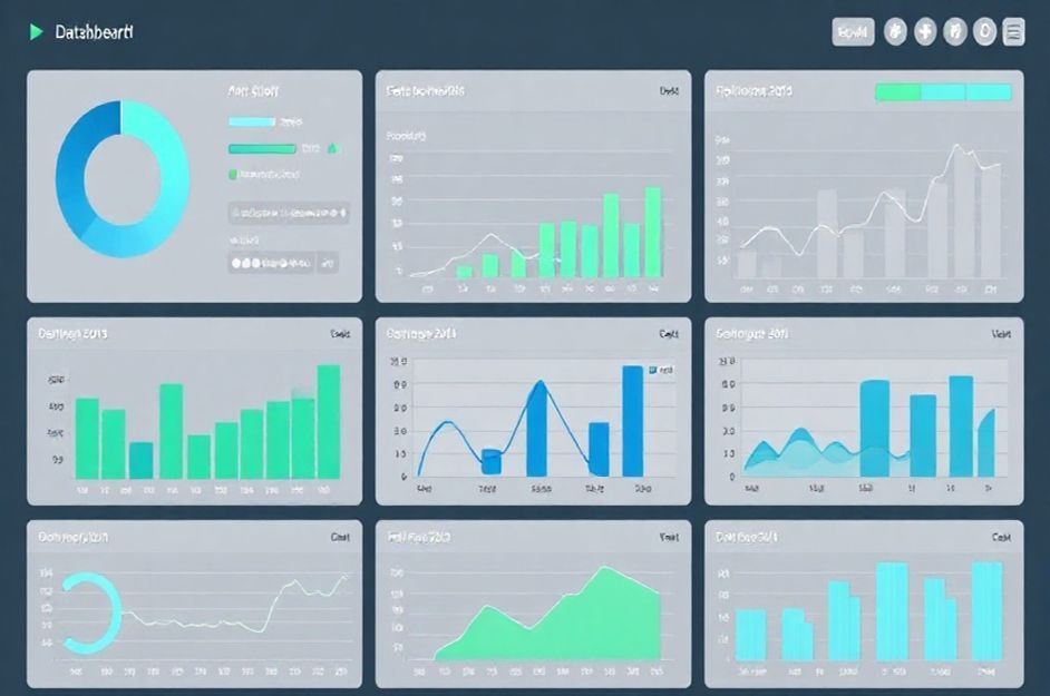
* **Pie Graphs: Show Proportions**
* **Bar Graphs: Compare Amounts**
* **Line Graphs: Illustrate Trends Over Time**
**Pie Graphs**
Pie graphs are frequently overused, often because of their simplicity and aesthetic appeal. They are best suited for illustrating proportions or shares of a whole, not for displaying absolute amounts. A pie graph excels at visually representing how much each element contributes to the total. While precise percentages are important, the slice sizes primarily communicate the story.
A pie graph is most effective with five or fewer segments, enabling quick comprehension of dominant groups. If you have more than five elements, consider whether all details are necessary or if smaller contributors can be grouped as “Other.”
To show volume contributions instead of fractions, use a bar graph.
**Bar Graphs**
Bar graphs compare the sizes and actual amounts of different segments. They feature a y-axis that clearly defines the units of measurement. Arranging bars side-by-side facilitates comparison and highlights absolute volumes.
Variations like stacked or 100% bar graphs exist, but these are best avoided in presentations, as they can be confusing.
**Line Graphs**
Line graphs inherently resonate with audiences. Viewers instinctively perceive the y-axis as “volume” (upward meaning “more”) and the x-axis as a timeline (left-to-right representing progression). This makes line graphs perfect for showing trends in amounts over time. The line’s elevation indicates the quantity at a given point. Capitalize on these subconscious associations to make your message clear.
**Data Labels**
Graphs simplify complex data, but they require integration of words, numbers, and visuals. Label graph elements directly whenever possible, avoiding legends, which force the audience to work harder. However, ensure labels don’t clutter the graph’s clarity.
When using multiple graphs, avoid overwhelming the audience with data overload. In many cases, element size alone conveys the story, eliminating the need for numbers. Consider using “reference slides” at the end of your presentation containing complete data. Hyperlink these slides for easy access if someone requests more detail.